
Graphic design
44th Andorra Fair
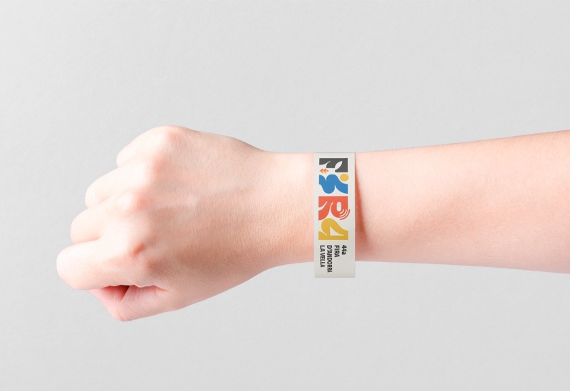
Visual identity for the 44th Andorra la Vella Fair.
Concept
Organic shapes
The design draws on soft graphic lines inspired by nature. You can find shapes that recall a leaf, a river, the sun...
We highlight Andorra's natural resources, especially for energy: water and sun.
Logo
Lettering
As a whole, the logo shows the word "FIRA" (Catalan for "fair") and, at the same time, the number "44" in the vertical letters "I" and "A". Each letter also carries its own symbolism.
The letter "F" represents the forests and mountains, so present and so essential to the country's past and future. The letter "I" is the sun and the river, which let us generate sustainable energy. The "R" speaks of connectivity and technology — the "smart city" concept and the balance between two Andorras: the natural and the modern. Finally, the letter "A" represents life and making the most of Andorra's resources.